 English
Wednesday - May 12, 2021 16:05
On the occasion of the Company's 20th anniversary (May 1, 2001 - May 1, 2021), the 20th anniversary logo creation contest was organized and received the participation of the company's staff and employees.
Requirements for the symbol are given as follows:
a. Content requirements: Demonstrate the company's unique characteristics.
b. Requirements for form of expression:
- Easy to remember, easy to recognize.
- Simple design, ensuring convenience in printing, reducing, enlarging and displaying on different types of materials.
- Do not use too complex colors (no more than 4 colors).
- Not duplicate or similar to any existing logo at home or abroad.
After the contest submission period ended, the Organizing Committee received many entries from employees and employees with creative and unique logo designs with typical meanings of the company.
Let's review the typical entries with the following logo symbols and logo descriptions:
01. Entries for Ms. Duong Thi Thu Tinh was honored to win the first prize of the contest:
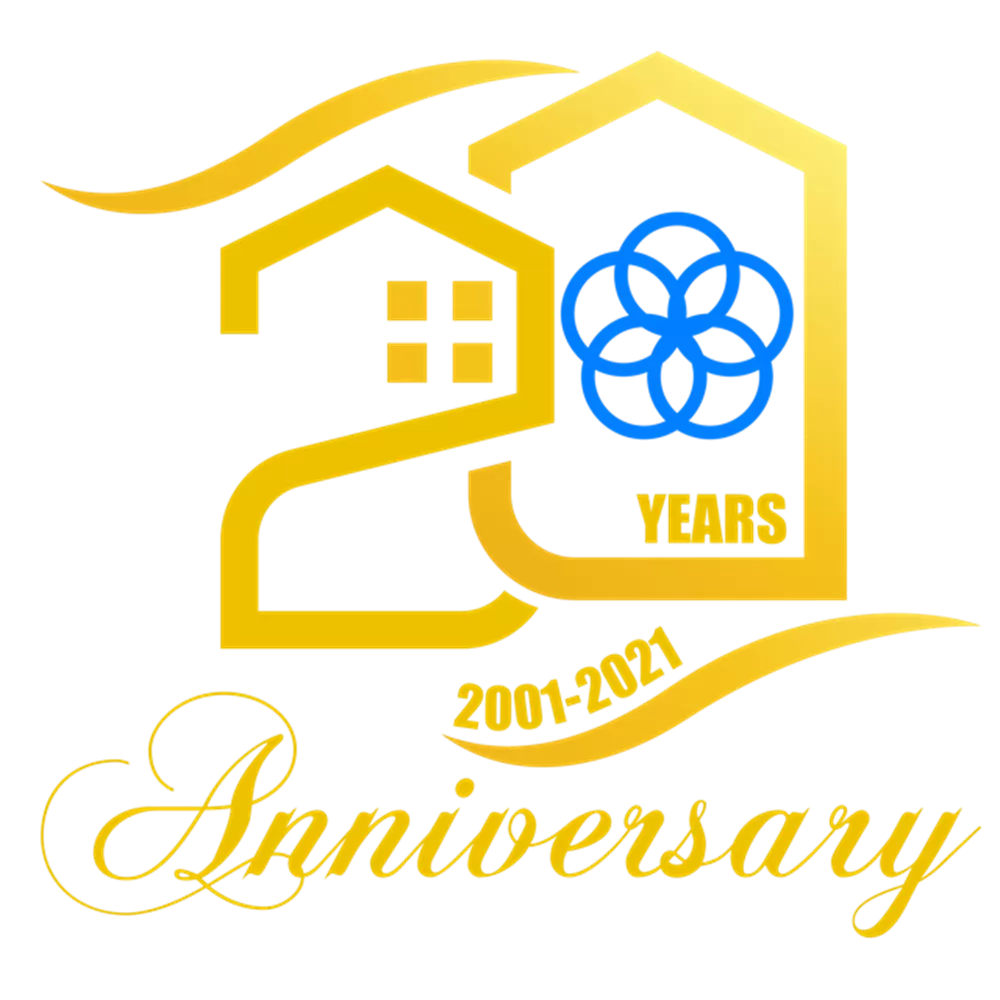
Contest symbol 01
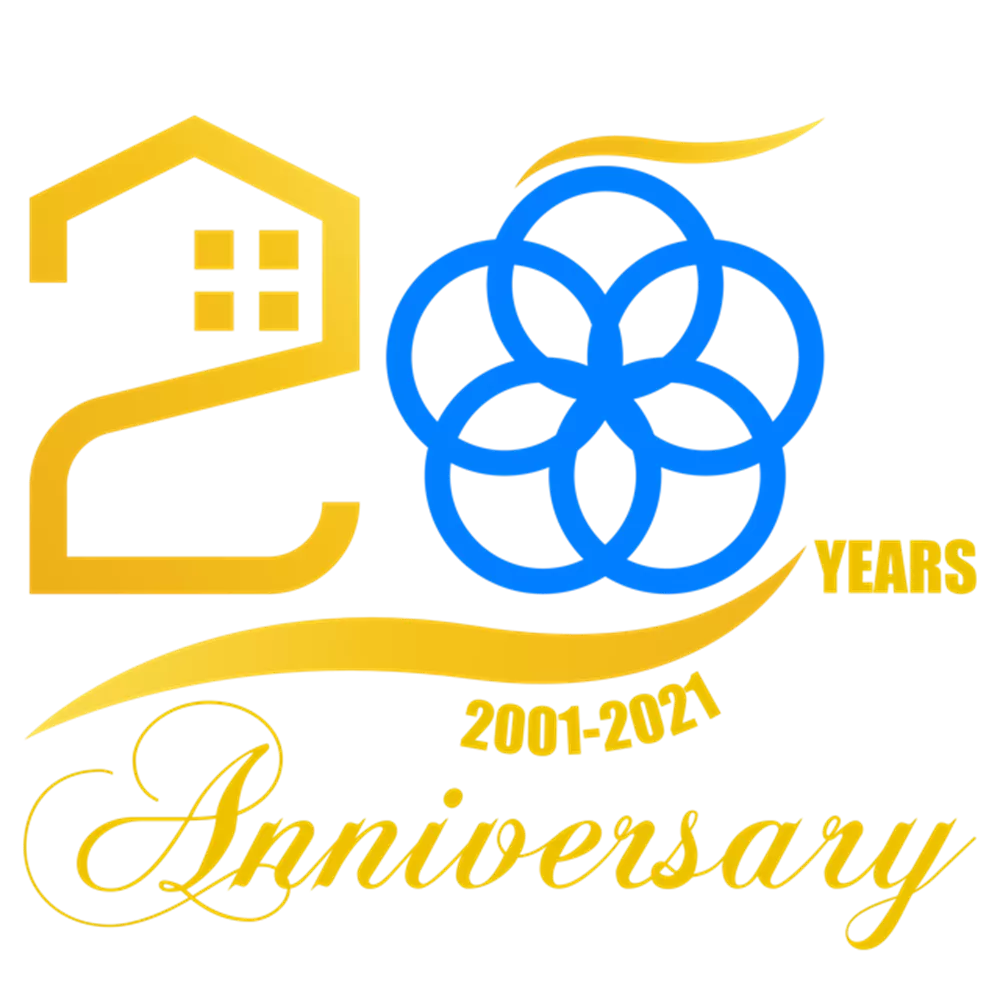
Contest symbol 02
"The symbol of 20 years is stylized by a house that goes from a simple "2" with shortcomings to a large, perfect "0" with a yellow-orange color scheme, which is no coincidence, but in the construction industry, how can it be lacking: the orange-yellow of the soil and the shining sunlight increases the hardship and hardship of the industry. The company's 5-pointed blue logo is embraced by the number 0, representing a beautiful image full of meaning for twenty years of formation, hardship, and hardship of development. To achieve the perfect progress as at the present time. Above and below the stylized number 20 are two wavy strokes with the meaning of hope that our company and our collective will increasingly strengthen our internal strength to continue to reach out like we have done in the past 20 years.
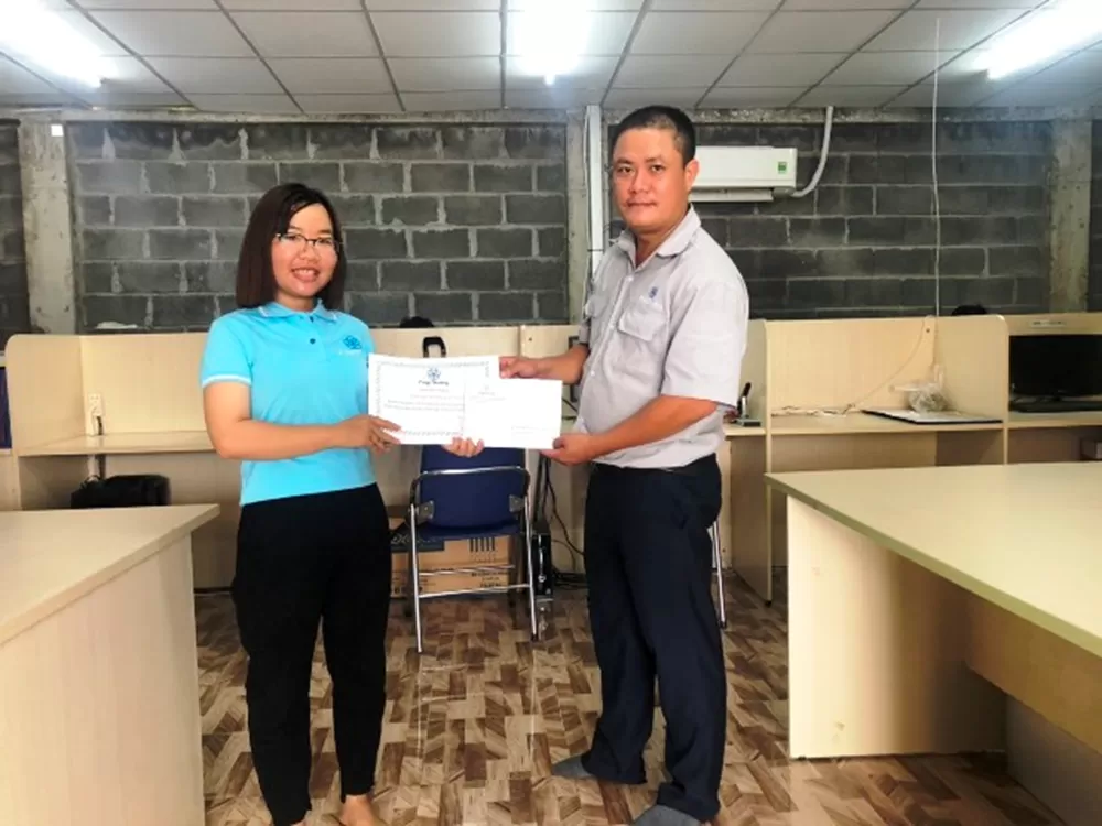
Awarded first prize in the competition
02. Entries for Ms. Nguyen Lu Nhat Quynh was honored to win the second prize of the contest:
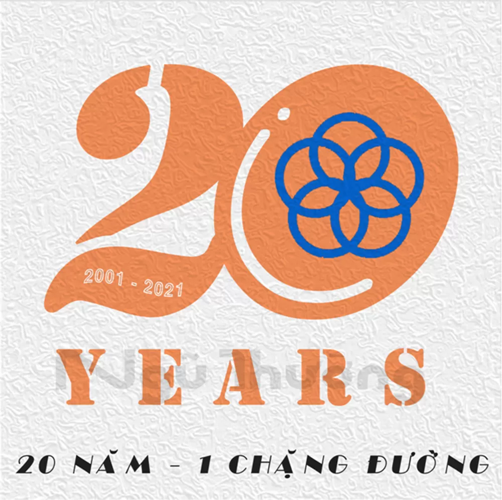
Contest symbol 01
“When we look at the logo we see numbers 20 "integrated, blended" together, the meaning here is 20 years - a period of time that is neither short nor too long, but for the company to achieve today's achievements thanks to the solidarity, enthusiasm, passion, and continuous creativity of all company employees.
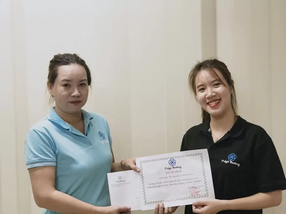
Awarded second prize in the competition
03. Entries for Ms. Nguyen Ngoc Tuyen was honored to win third prize of the contest:
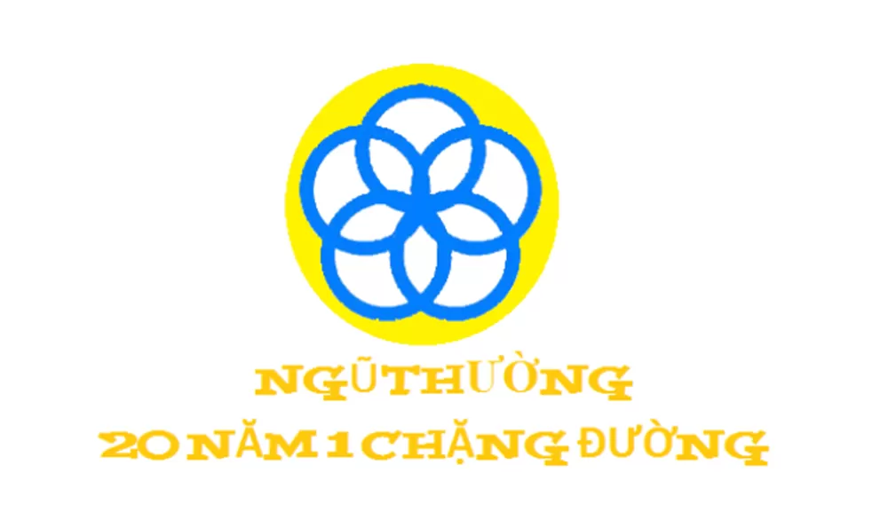
Contest symbol 01
Meaning: Truth, perfection, goodness, beauty.
Sincerity - Integrity - Friendliness - Perfection - Development
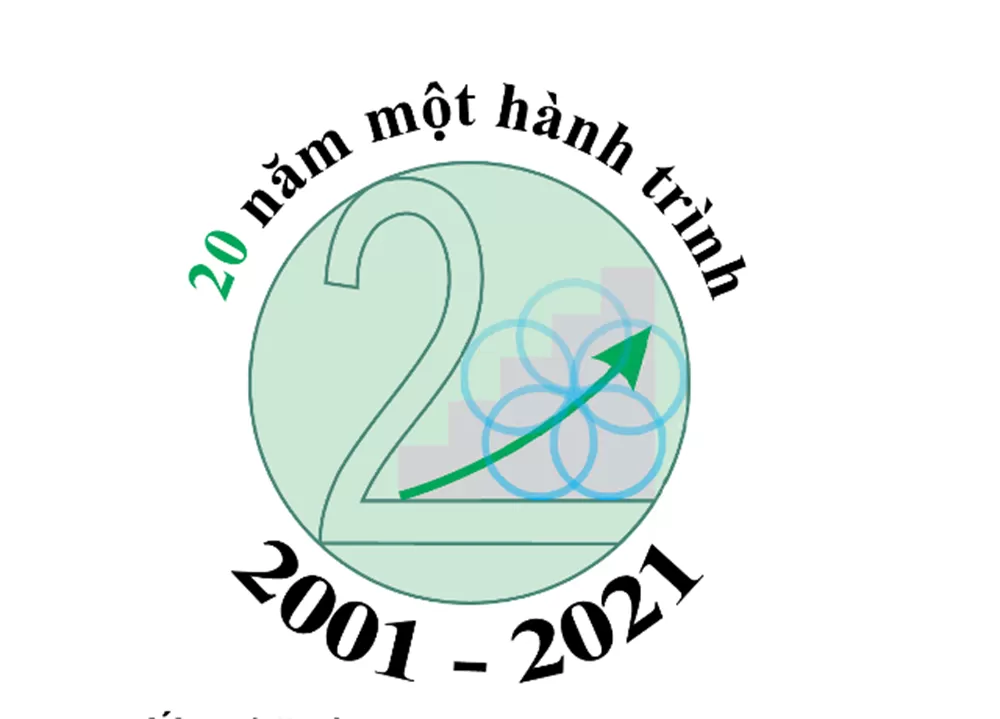
Contest symbol 02
Meaning: Solidarity, unity and development





Comment